Healthcare has been one of the hottest topics covered on the blog over the past year or so, with a number of projects emerging in this fascinating field.
For instance we’ve had attempts to crowdsource medical diagnosis and indeed clinical trials in recent times. Social communities have emerged to help reduce various diseases, from HIV to smoking. Research has established the benefits clinicians can gain from sharing information and knowledge amongst their peers.
And of course we’ve seen a huge jump in the number and range of mobile applications targeting the healthcare industry, culminating in the X Prize to develop a Star Trek style device to measure our bodily functions for us.
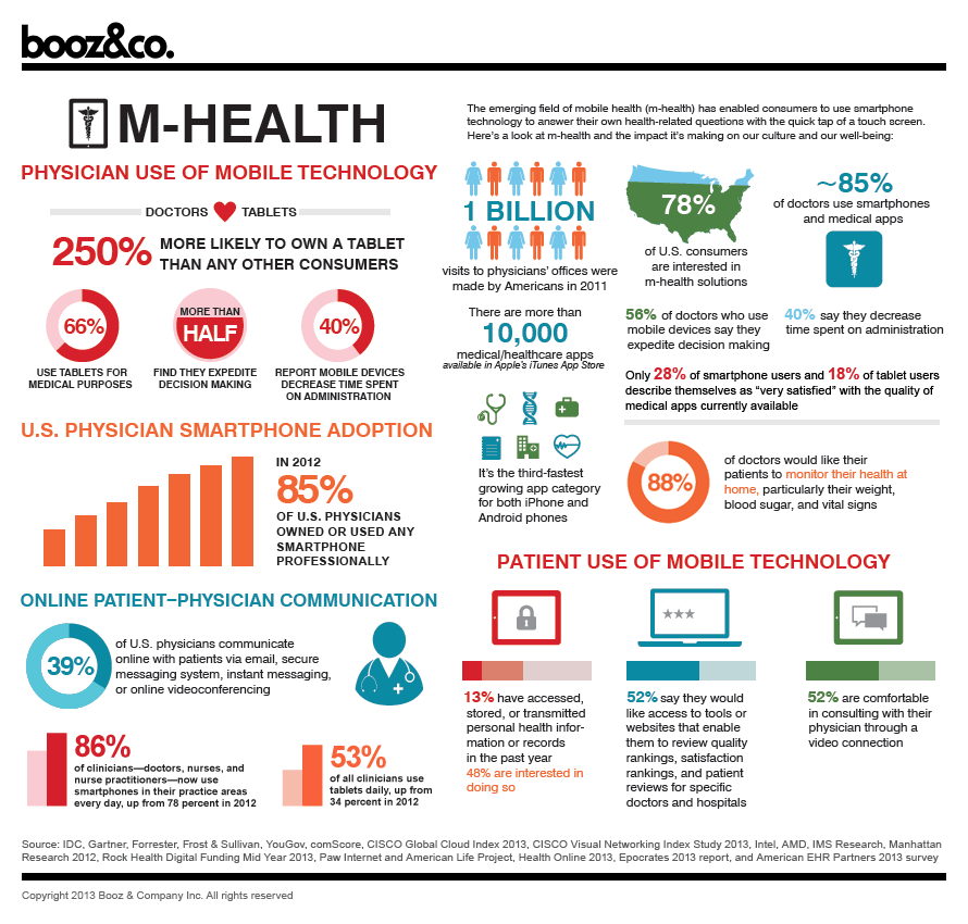
It’s an exciting time for the industry I feel, so much so that I’m breaking a habit and publishing an infographic. Normally I dislike them enormously, but the following one, produced by Booz&Co, provides a nice overview of the state of digital healthcare at the moment. If you work in this field, hopefully it will help you gain an overview of where we’re at.

Hello Adi,
Thanks for the article, I love reading your posts on healthcare and the innovative initiatives in that field.
In this post you mention that you dislike infographics. Can you tell what you don't like about them? Thanks!
Thanks for the comment Vanessa, there are some fascinating things happening in healthcare. Over the next week I'll be writing about some of the cool things that emerged from the recent Health 2.0 conference, so stay tuned 🙂
Regarding infographics, I guess I'm just not convinced that they portray the information in very much depth. I always feel that they need text to accompany them, yet the format and size of the graphics often make that impractical for the blogger to do.
Nice infographic Adi.