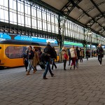
 It’s become commonplace for a range of public transport to provide an improved set of information to passengers. Most for instance now provide live time-tabling so that people can see how long it will be before their bus or train arrives. One thing often lacking however is any kind of idea about the train itself, other than of course its location.
As a cyclist this is often a nuisance as there are limited carriages fit to carry a bike, so you have to run along the platform to the bike carriage and hope that there is enough room to store your own machine. If not you have to resort to chasing down to the other carriage in the same hope. All of this in cycling shoes where running is far from easy at the best of times.
Whilst I don’t think they’re doing anything to help cyclists know where the bike carriage will be, a Dutch company is at least doing things to help passengers know how busy the upcoming train is. The innovation comes via the Edenspiekermann design agency, who have developed a LED display for each platform that not only provides the usual timetable information, but can also provide passengers with details such as the congestion on the train itself.
In addition to providing passengers with information on the congestion of the train, it also provides them with information on where they should stand on the platform so that they are in the right spot for specific carriages, whether it’s first class or disabled (or indeed the bicycle) carriages.
The display itself is 180 metres long and spans the length of the platform. Numbers within the strip highlight whether the carriage is first class or standard, and there is also a marker highlighting the exact position of the doors. Symbols will highlight things such as the disabled and bike carriages, but also information such as carriages fit for buggies, large luggage, and even the quiet carriages.
The capacity of the train will be detected using infrared sensors within each train that will be able to gauge how full each carriage is. If the LED strip shows as green, then seats are available. A yellow display reveals that the carriage is pretty full, whereas a red suggests you’re out of luck.
The system was trialled last year at the Den Bosch station, and the plan now is to roll it out across the country over the next couple of years. It’s a great example of how relatively simple technologies can be used to make the customer process considerably better.
Haha, that's pretty cool. Nice.
What a great idea. Puts the UK stations to shame.