 The last few years have seen a growing number of projects attempting to derive insights into our behaviors from our social media data.
The Gnip project, for instance, offers researchers access to the full Twitter data pipe for their studies. The access has led to a number of interesting insights, including Obamacare enrolment, possible terrorist activity, and even the income of users.
An emotional map
So it’s interesting to see the We Feel project attempt to use this social data to provide an accurate and real-time signal of our emotional state.
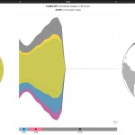
The project, which began a few years ago was documented in a recently published paper. It provides a telling example of the tool in use as it monitored the reaction to the death of Australian cricketer Phillip Hughes.
It visualizes a peak of sadness, together with a clear distinction around the gender of the tweets. The tool also allows people to drill down into region, to thus allow users to explore geographic as well as gender differences in the emotion felt at that time.
By doing all of this analysis in real-time, it offers users the ability to take the emotional pulse of the world directly after significant events in a quick and easy manner.
Predicting micro-events
Whilst there are clear use-cases for large, significant events, the team also hope it can find a use in more personal issues too. For instance, the team hope that it can identify when people are at risk of depression, and how our moods fluctuate over time.
It could also provide insight into how influential external events such as the weather, time of the day or major events such as economic instability are on our general mood.
Whilst information on these kind of things is tracked via things such as the Black Dog Index, this insight is typically not delivered in real-time or on a day to day basis.
As such, it’s certainly a useful project to keep an eye on. We’ve seen how valuable social data can be in generating insights in a wide range of ways, so it’s a method that it seems inevitable will grow.