I’ve written a few times recently about the changes in approach and attitude required by employers, individuals and indeed society as a whole if we’re to thrive in an aging society. Whilst the general trend across the western world is one of lengthening life expectancy, the trend is not uniform.
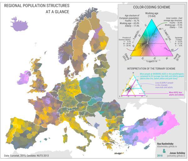
So a recent study from the University of Southern Denmark is interesting, as it sets out to explore how the various countries across Europe are aging. The results were illustrated in a map, reproduced below.
 It’s already been established by UN data that half of the EU population is over 43 years of age. This does not paint the full picture however. The map produced for the research aims to provide a more nuanced interpretation of each country’s demographics.
The color coding on the map aims to visually simulate the breakdown, with yellow representing older people, pink children and blue for working-age people. The mixture of colors thus represents the mixture of ages, with brighter colors showing a divergence from the European average.
So the bright yellow spots that are evident in parts of France and Germany are representative of a large elderly population. The areas that are pink however, such as Kurdistan in Turkey, are much younger populations.
Filling in gaps
Migration helps to fill in clear gaps, with the young Polish population migrating in large numbers to older countries, such as neighboring Germany, which has a older eastern region on the border with Poland.
The stats reveal the uneven nature of aging in Europe, with clear differences between countries, and even within countries. For instance, in Belgium, the southern Wallonia region is relatively young, whereas the northern Flanders region is older, and more akin to that of the average in Central Europe.
Likewise in Spain, the coastal regions tend to be a lot younger than the central areas, due in large part to the concentration of migrants in theses area in the 2000s.
Similar differences appear when comparing urban and rural populations, with urban regions tending to have larger working-age populations.
“Highly urbanised areas and capital cities tend to attract young professionals”, the researchers say, “while young families with children often move from the city centre to the suburbs.”
This is clearly evident in areas such as Paris and London, which are much younger than their surroundings. The more rural areas seem to be aging at a much faster pace, with the young people that are in those locations attracted to urban areas for work.
It’s an interesting insight into the nuances of demography across Europe, and the researchers hope to produce a similar map for the United States and Russia in future. As we attempt to get a better grasp on the challenges presented by demography, and specifically our aging society, it’s a level of understanding that could prove invaluable.