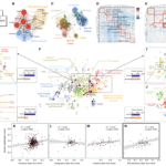
 In a globalized world, there is a sense that we’re pretty good at understanding the flow of trade throughout the world, but we’re perhaps less clued up on the flow of people. Researchers at Indiana University aim to overcome that gap in a recently published study whereby they team up with LinkedIn to create a global map of labor flow.
The data revealed some interesting patterns, including some unexpected connections between industries such as credit cards and air travel, while also being a fairly accurate barometer of the overall health of industries, with the likes of oil and gas and pharmaceuticals doing well, whereas retail and telecoms struggled.
The maps were created using the data LinkedIn has on the 500 million members of the site. The researchers monitored their usage between 1990 and 2015, as well as assessing around 130 million specific job transitions between over 4 million companies during that period.
The team believe that the map allows them to clearly identify geo-industrial clusters by using network community detection, while also identifying the importance of labor mobility to regions and to industries. The data can also support the comparison of geo-industrial clusters and their role in economic growth, and of course the skills that underpin such growth.
“As the first attempt, in our best knowledge, to map the hierarchical structure of the global economy our approach suggests a lot of possible directions for future studies including the relationship between different skills, the job mobility pattern of workers based on their skill similarities, the role of skill influx on the growth of a geo-industrial cluster and etc.,” the researchers explain. “Furthermore, we expect this study will provide a powerful foundation for further systematic analysis of geo-industrial clusters in the context of business strategy, urban economics, regional economics, and international development fields – as well as providing useful insights for policymakers and business leaders.”