 I’ve written a number of times about the various ways urban planners are using crowd and mobile based data to help them design smarter cities.
For instance, a paper from earlier this year used Twitter to highlight the different ways a city was used during the day and during the night.
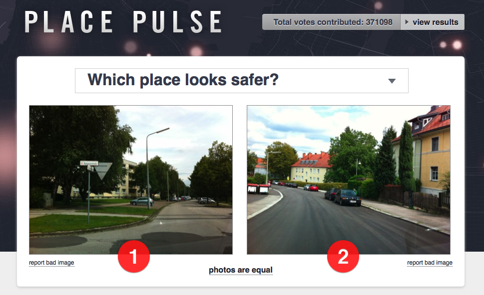
A recent MIT project is looking to use the crowd to better understand which parts of the city are more desirable. The project is built on a 2011 project called Place Pulse, which I covered a few years ago, which gave people two Google Street View images of a city and asked them to choose the one that appeared more desirable.
The latest project, called StreetScore, sees a high resolution map of urban perceptions created based upon the data from the Place Pulse project. The aim is for the data to support research into any connections between perceptions of an area and crime rates.
The map is created via an algorithm, which is capable of breaking down an image into its various components, whether that’s a building, a person and so on.
Depending on how each image was rated by Place Pulse users, each image is then assigned a safety score of between 1 and 10. This aggregated score is then visualized on the map, with green being safest and red being the most dangerous.
The project has thus far mapped New York and Boston, with plans to roll out maps for Detroit and Chicago in the coming days, before then hopefully covering multiple cities from around the world (as they’re added to Place Pulse).
In time, the designers hope that they will be able to identify features that appear to characterize safer areas of a city, with planners then able to work on making more dangerous areas safer.
How accurate is the algorithm?
The success of the project will undoubtedly rest on the accuracy of both the input from the crowd, and how that is compiled into a map by the algorithm.
At the moment, it is based on a relatively small sample of a few thousand selections in a few US cities. Is it possible therefore to extrapolate what makes people feel safe in New York would be the same in London or Tokyo?
Place Pulse has recently expanded to cover 56 cities from around the world so the map will hopefully have a much richer data set to choose from, and the richer this data set, the fewer anomalies that will crop up in the map.
The other issue, of course, is whether the map provides sufficient insight into what makes an area unsafe. Sure, it might emerge trends such as tree lined streets appear safer than barren ones, but it’s unlikely that the presence of trees in isolation will deter criminals.
A recent German study, for instance, highlighted that the theory of broken windows is a lot more nuanced than traditionally thought.
Nevertheless, it would appear sensible for there to be a strong connection between the perceived safety of an area and the crime rates in that location.
This kind of tool can therefore be invaluable in both providing an easily scalable means of collecting data on a city, and the computing power to generate insight out of that data.