 Earlier this week I looked at a new project called Sphaera, which is designed to help spread good ideas and initiatives. The platform will provide a facility for organizations to share what has worked for them. This information will then be turned into tools, processes and frameworks by the platform, in order for other users to make use of them.
It rests on the premise that most innovation is recombinative in the sense that it uses what is already here, albeit in new ways, rather than inventing something entirely new.
Sharing innovative projects
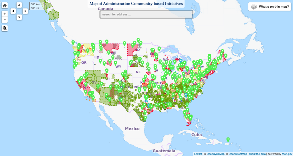
So it’s interesting to see a new tool launched by the White House recently to help people gain a visual understanding of the kind of work that is being done by the government around the country.
The tool has been constructed via a team of 15 Federal agencies and comes in the form of a map of the country, complete with various data layers that allow users to see where various projects are taking shape.
“This new approach focuses on the direction that cities and small towns want to go rather than the laundry list of programs the government has,” the project team says.
The facility highlights a whole range of projects, from educational ventures to environmental ones, economic projects to social initiatives. It also offers users a range of demographic information, including census data and socioeconomic data from Harvard.
Open to improvements
What’s more, the map is also open source, with the code available on GitHub for data enthusiasts to use, extend and manipulate as they see fit. The project has the full support of the White House, who have pledged to ensure it receives a steady supply of data updates for developers to work with.
It’s a nice project and well worth checking out.