 That inequality exists is unmistakable, as is the fact that a great deal of confusion exists about its scale and the causes of it. A new tool produced by the University of Sheffield aims to remove some of this uncertainty by mapping 149 ‘Travel To Work Areas (TTWAs)’ across England, and from this highlighting the levels of inequality in each area.
Th English Atlas of Inequality has been supported by the Nuffield Foundation and uses three measures of inequality to try and provide a robust measure for each area. It then maps these with population data on things such as mortality, poverty and entry to higher education to explore how distinct approaches to understanding inequality can provide very different results.
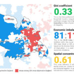
The map was built using the Gini coefficient, the 20:20 Index and Moran’s I, each of which looks at inequality from a slightly different perspective. In a report to accompany the release, the researchers argue that their work illustrates the risks involved in using a solitary measure of inequality.
“When we look at the income distribution in Sheffield, the city is less unequal than some other major English cities, such as London or Cambridge,” the researchers explain. “However, when we look at Sheffield’s neighborhoods, 81 feature as being among the least deprived 20 percent in England on income, whereas 116 neighborhoods feature among England’s most deprived 20 percent.”
A mixed picture
Equally, if one were to use solely the Gini coefficient, then a number of the poorest coastal communities in England would be low down the priority list as the inequality is low, despite poverty generally being high.
By contrast, when inequality was measured via geographic income clusterings, it was more common for patterns of income deprivation to match those of outcomes more broadly.
Interestingly, the analysis found that many of the poorest people in the country weren’t residing in the poorest locations, but at the moment it’s not entirely clear why this might be.
“Our atlas highlights the fact that no one measure of inequality paints the full picture and that methodological diversity is needed before we start to think of solutions to inequality at a local, sub-national and national level,” the researchers say. “There are some confounding features of inequality in that some of England’s most unequal places have some of the best outcomes on key measures such as mortality and entry to higher education. Yet the opposite is also often true.”
The atlas provides a timely reminder that measuring inequality is not a simple art, and that poverty alleviation and equality of opportunity are as important to focus on as inequality. The project also reminds us that how we measure inequality plays a fundamental role in how we understand it, and the team hope that the atlas goes at least some way towards helping enhance our understanding.